Field Crisp
Snack Foods Brand Identity & Packaging Design
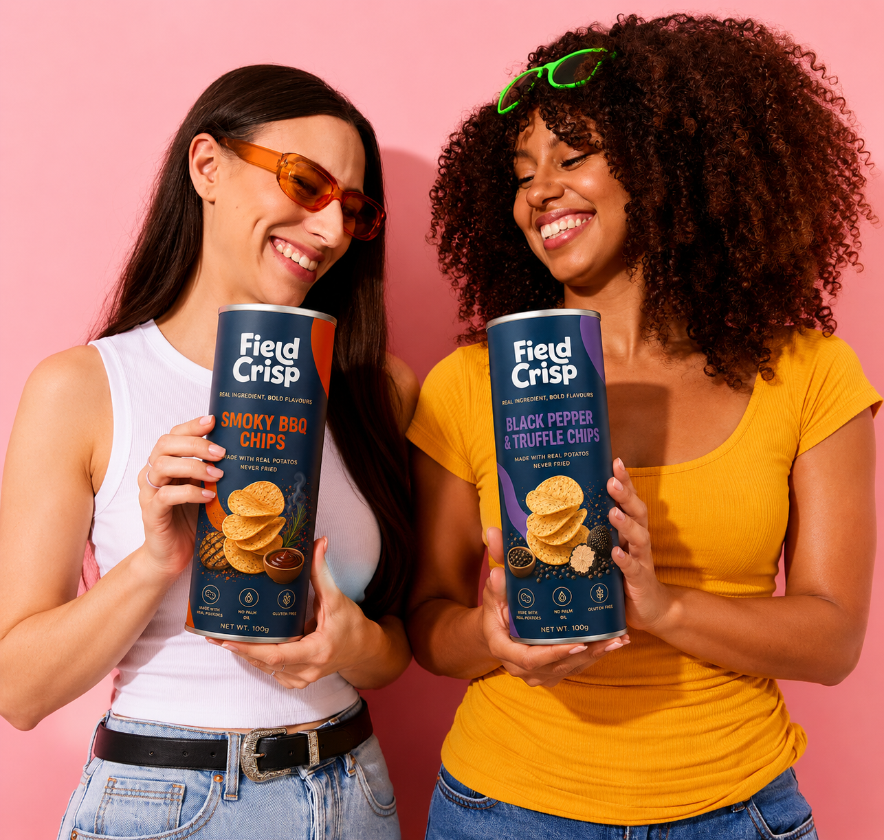
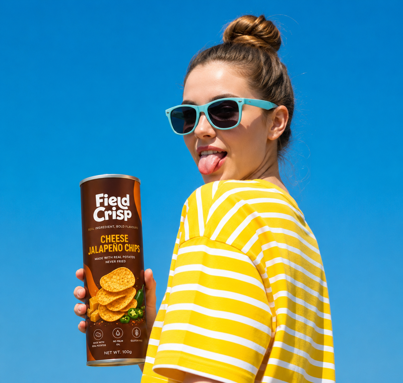
Field Crisp is a premium potato chips brand created for modern consumers who seek bold flavors, quality ingredients, and a more conscious snacking experience. Positioned at the intersection of indulgence and better-for-you snacking, the brand appeals to young professionals, families, and flavor enthusiasts looking for products that deliver both taste and trust.
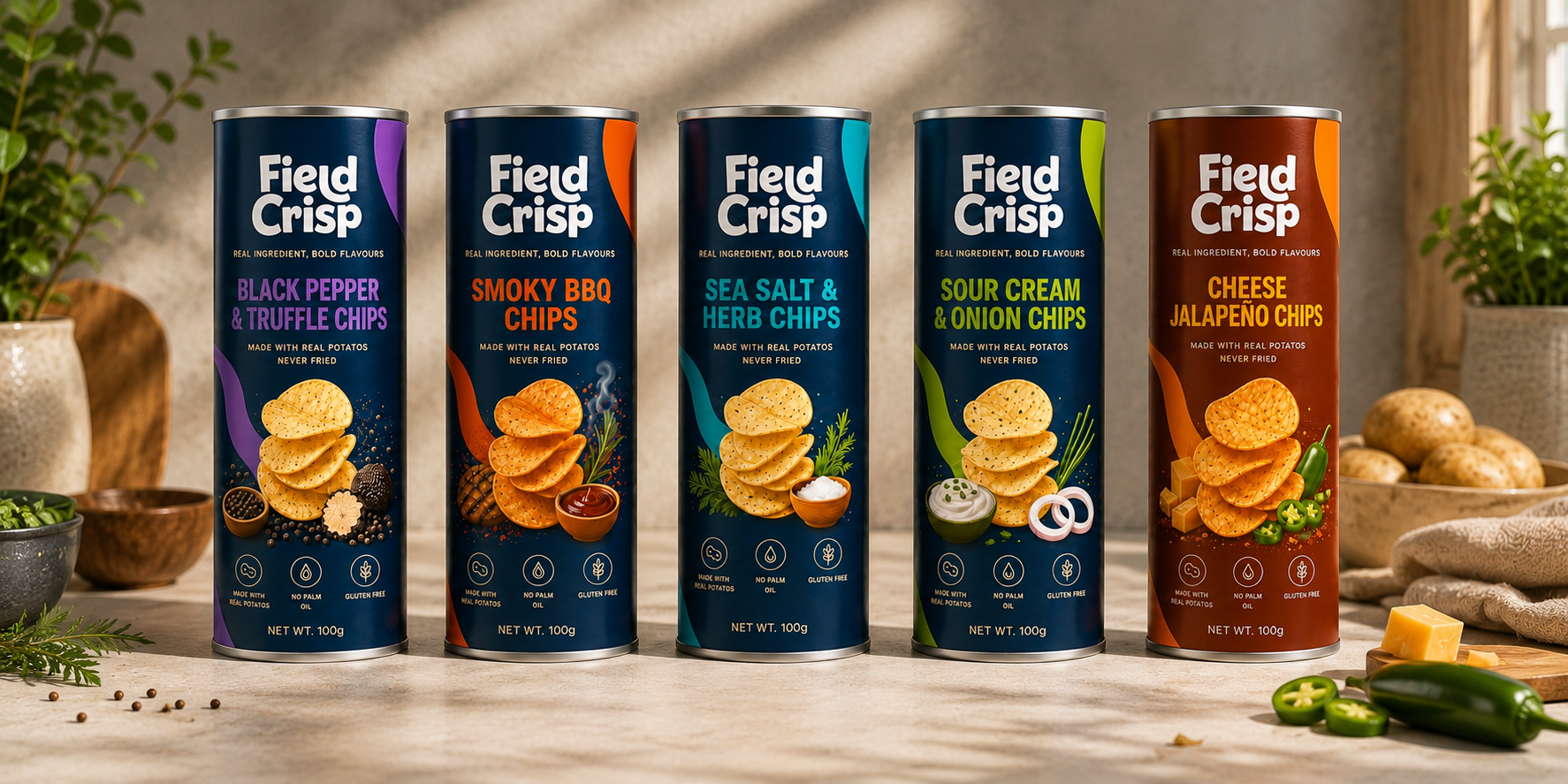
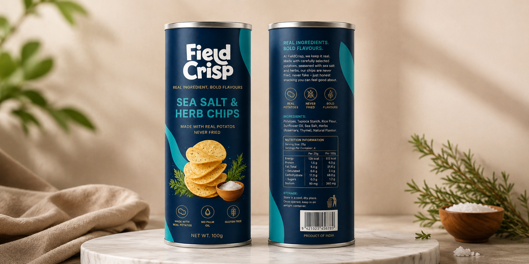
The brand identity was developed to communicate confidence, freshness, and premium quality. A bold, contemporary logotype paired with clean typography creates strong visibility and instant recognition. The deep navy color palette serves as a sophisticated foundation, while vibrant accent colors differentiate each flavor variant and bring energy to the range. The overall design direction balances modern simplicity with appetizing visual storytelling to create a distinctive and memorable brand presence.
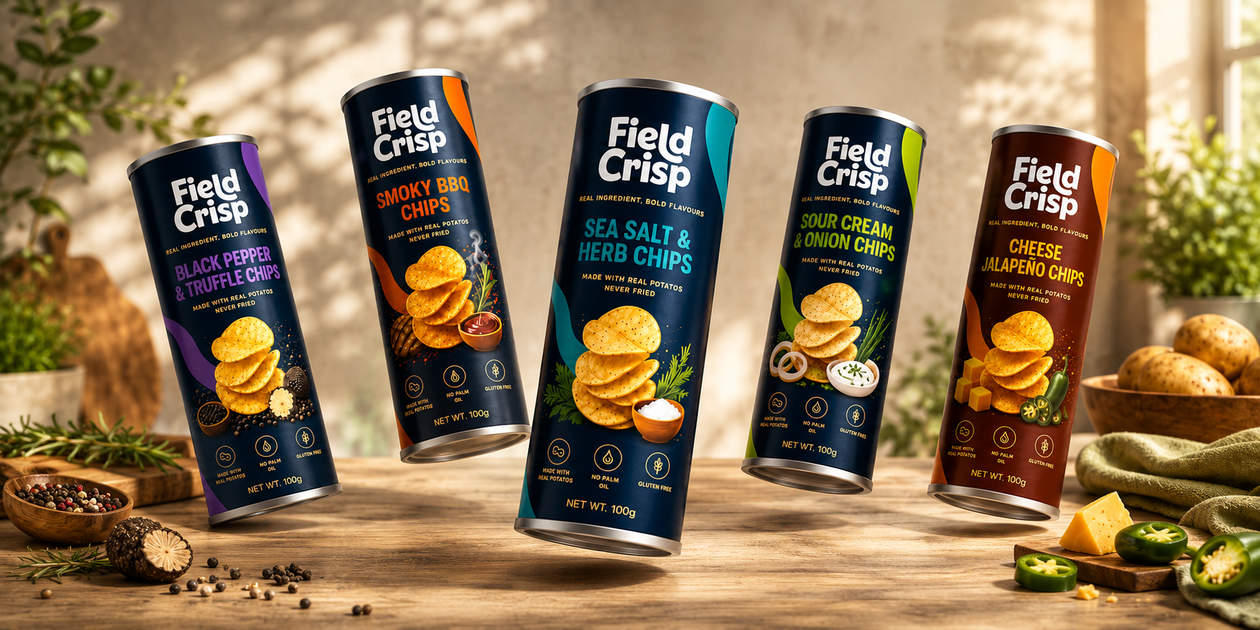
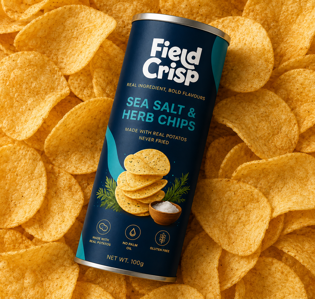
The packaging system was designed to maximize shelf impact while maintaining consistency across the product portfolio. High-quality ingredient illustrations and realistic chip visuals showcase flavor authenticity and product appeal. Each flavor is assigned a unique color code, enabling easy navigation and strong brand recognition across the range. Premium cylindrical packaging, metallic accents, and clean information hierarchy reinforce the product’s quality positioning while ensuring a cohesive visual experience both in-store and online.
The result is a bold and scalable FMCG brand that stands out in a highly competitive snack category. By combining a strong visual identity, impactful packaging, and a clear brand story, Field Crisp establishes a memorable presence that resonates with consumers and builds long-term brand recognition.
Services
Brand Strategy • Brand Identity • Logo Design • Packaging Design • Print Design • Visual Identity • Product Mockups
