Joy Cubes
Fruit Jelly Candy Brand Identity & Packaging Design
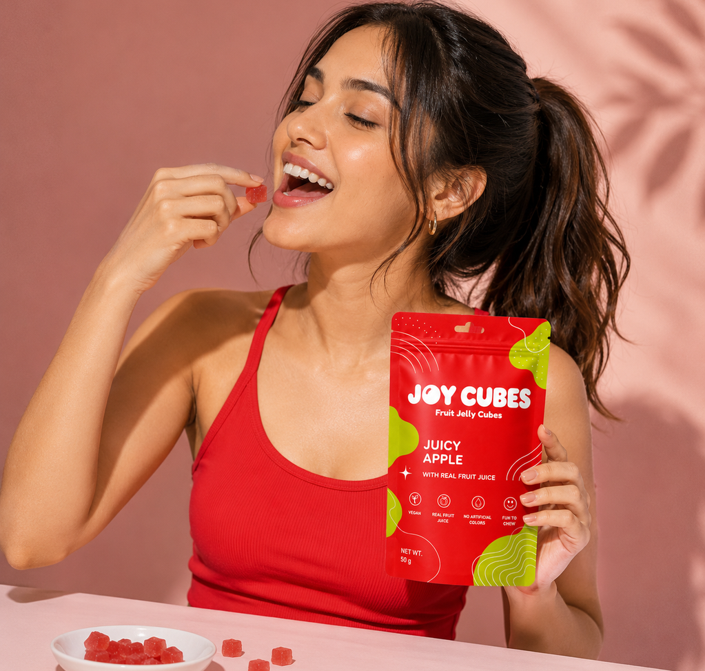
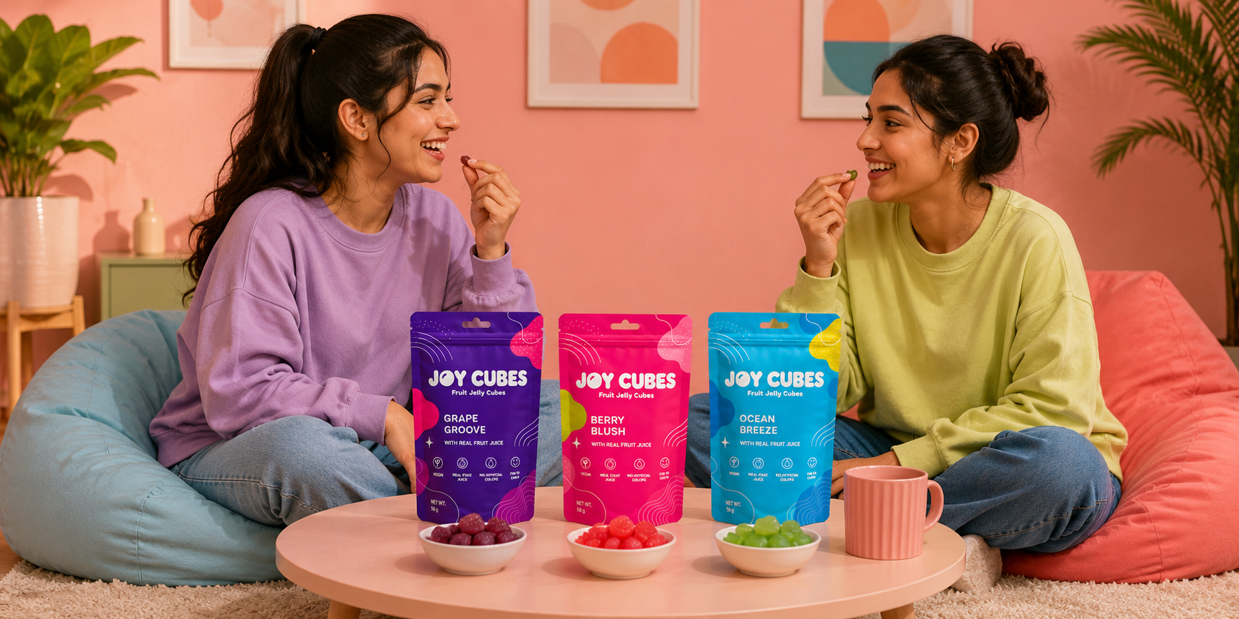
Joy Cubes is a vibrant fruit jelly candy brand designed to bring fun, flavor, and excitement to everyday snacking. Created for children, teenagers, and young-at-heart consumers, the brand focuses on delivering playful experiences through fruity flavors, colorful visuals, and convenient on-the-go packaging. Positioned as a cheerful and modern confectionery brand, Joy Cubes celebrates moments of happiness with every bite.
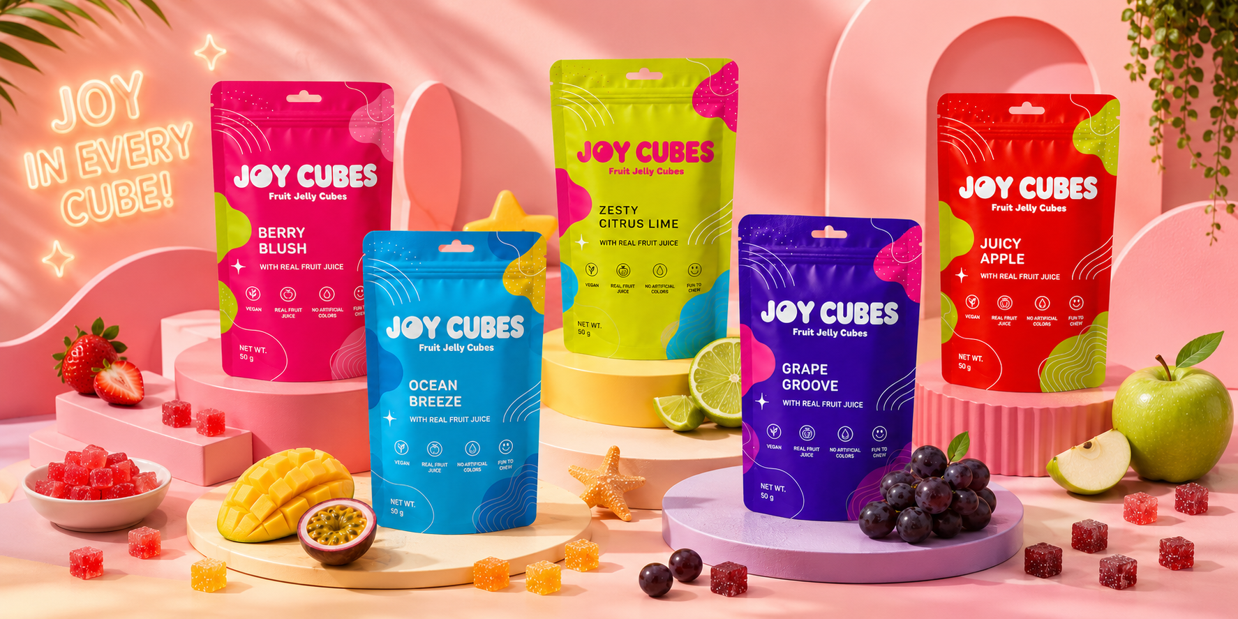
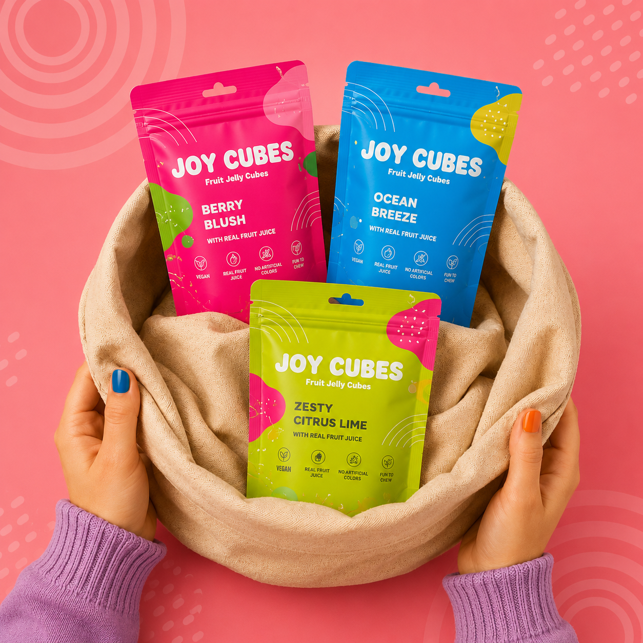
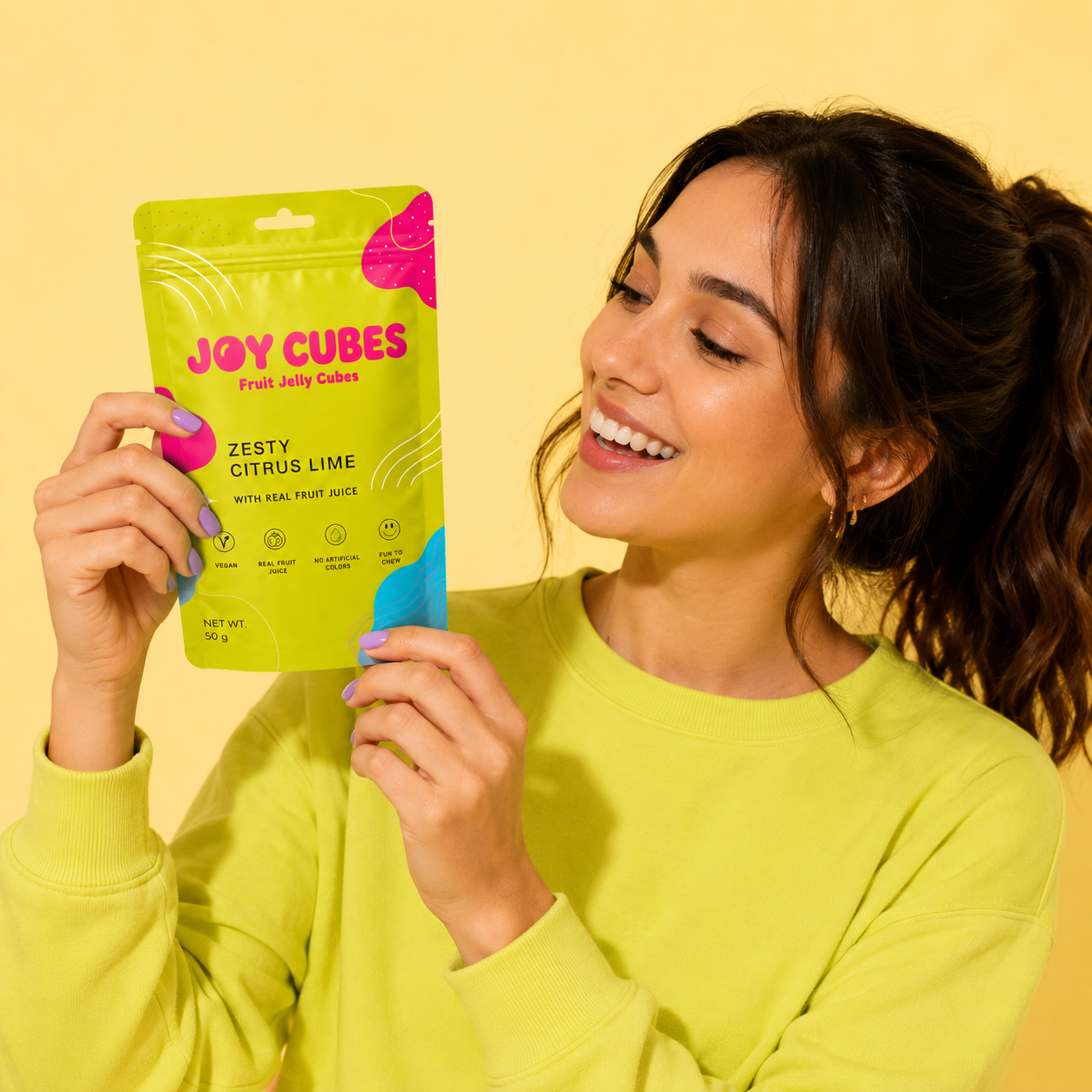
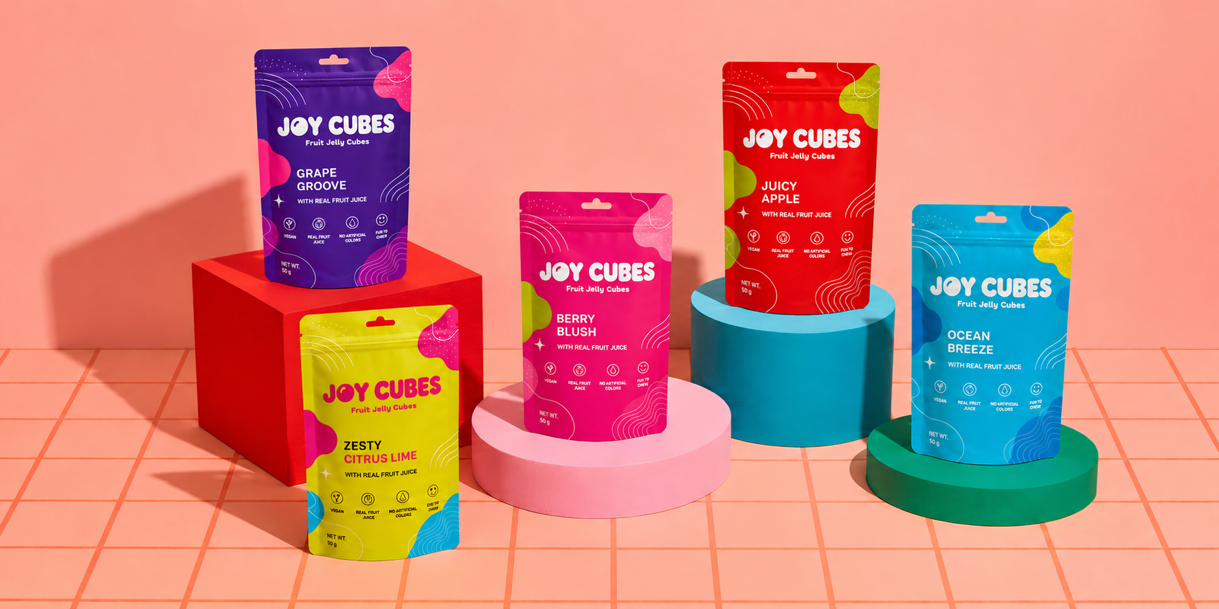
The brand identity was developed around the idea of joy, energy, and self-expression. A bold custom logotype with soft, rounded letterforms creates a friendly and approachable personality, while bright color palettes instantly communicate flavor variety and fun. Dynamic graphic elements, playful shapes, and fluid patterns add movement and excitement, creating a visual language that feels youthful, memorable, and engaging across all touchpoints.
The packaging system was designed to maximize shelf visibility and create strong product recognition in a competitive confectionery market. Each flavor variant is distinguished through vibrant color coding while maintaining a cohesive brand structure. Modern stand-up pouches provide convenience and freshness, while clean layouts, playful illustrations, and fruit-inspired graphics communicate flavor cues quickly and effectively. The bold visual system ensures standout presence both in retail environments and digital marketplaces.
The result is a distinctive confectionery brand that captures attention through color, personality, and playful design. By combining a strong visual identity with an impactful packaging system, Joy Cubes establishes a memorable brand presence that appeals to modern consumers and creates lasting recognition in the fast-moving candy and snack category.
Services
Brand Strategy • Brand Identity • Logo Design • Packaging Design • Print Design • Visual Identity • Product Mockups
