Harvest Hills
Premium Nuts & Healthy Snacks Brand Identity & Packaging Design
Harvest Hills is a premium nuts and healthy snacks brand inspired by nature’s goodness and wholesome living. Designed for health-conscious consumers seeking nutritious, high-quality snacks, the brand combines natural ingredients with a refined, modern presentation. Positioned within the growing wellness and FMCG market, Harvest Hills represents purity, authenticity, and everyday nourishment.
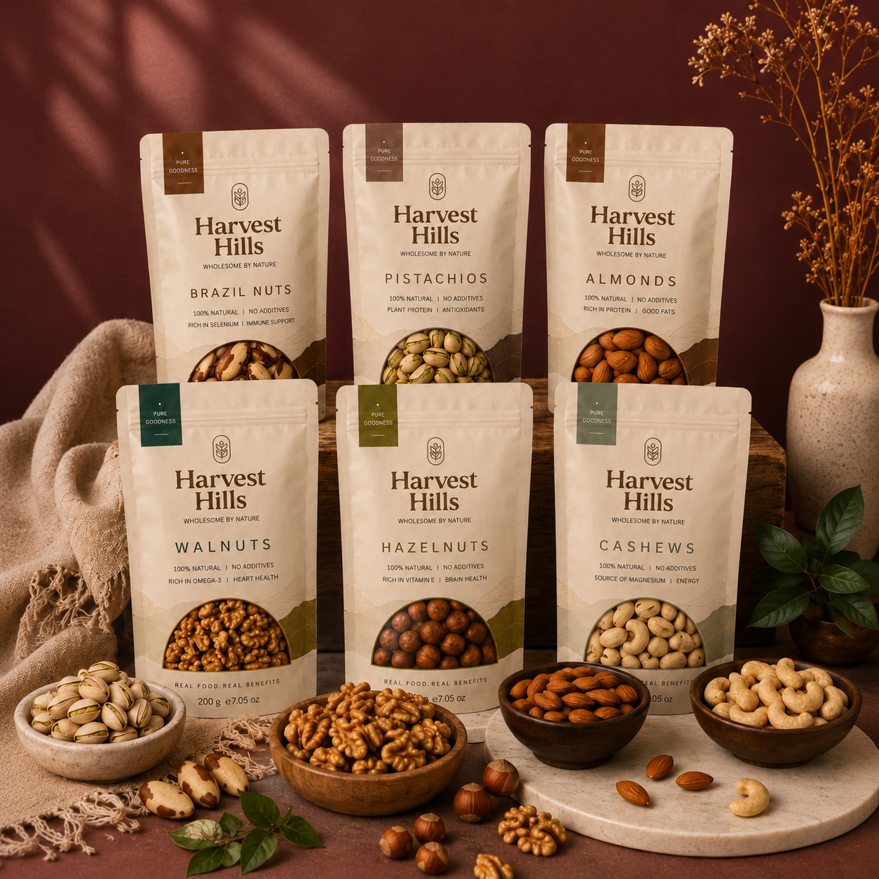
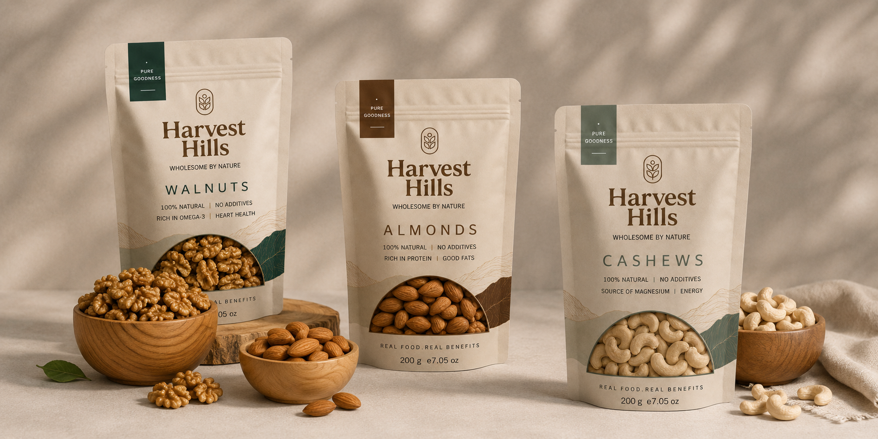
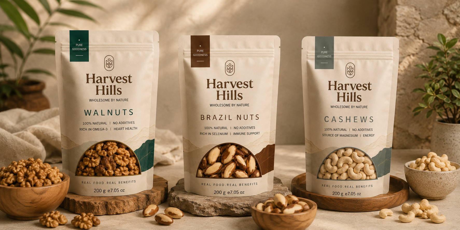
The brand identity was crafted to communicate trust, quality, and natural abundance. A timeless serif wordmark paired with a simple agricultural-inspired symbol creates a strong and memorable visual presence. Warm earthy tones, elegant typography, and subtle landscape illustrations reinforce the brand’s connection to nature while maintaining a premium and contemporary appeal. Every design element was carefully developed to reflect freshness, sustainability, and wholesome nutrition.
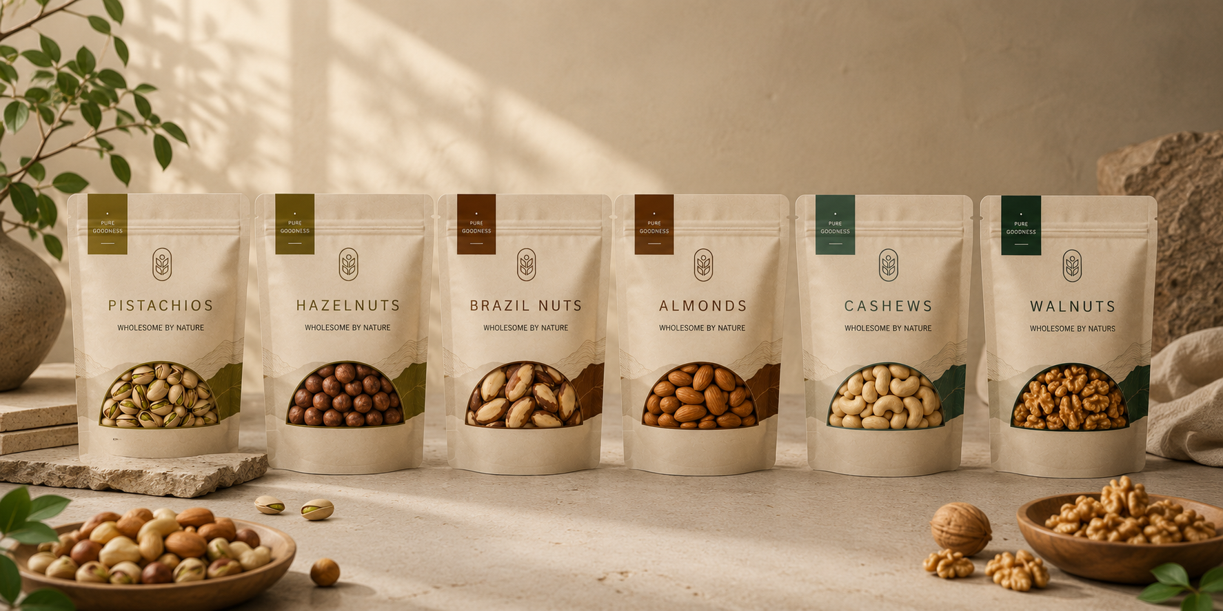
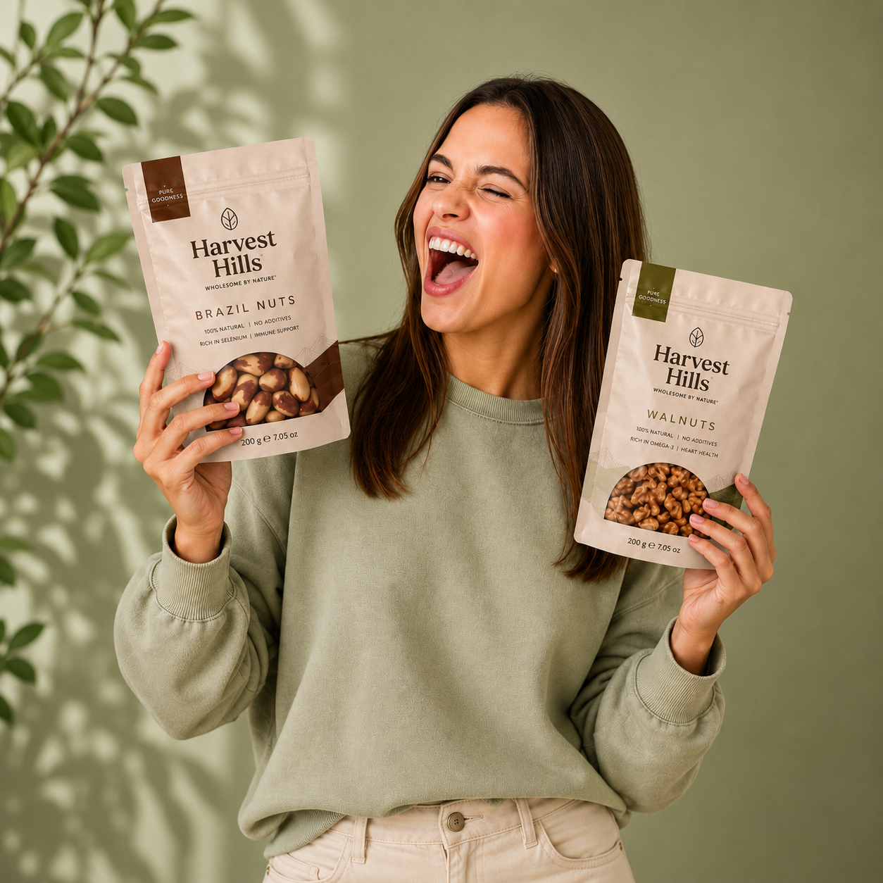
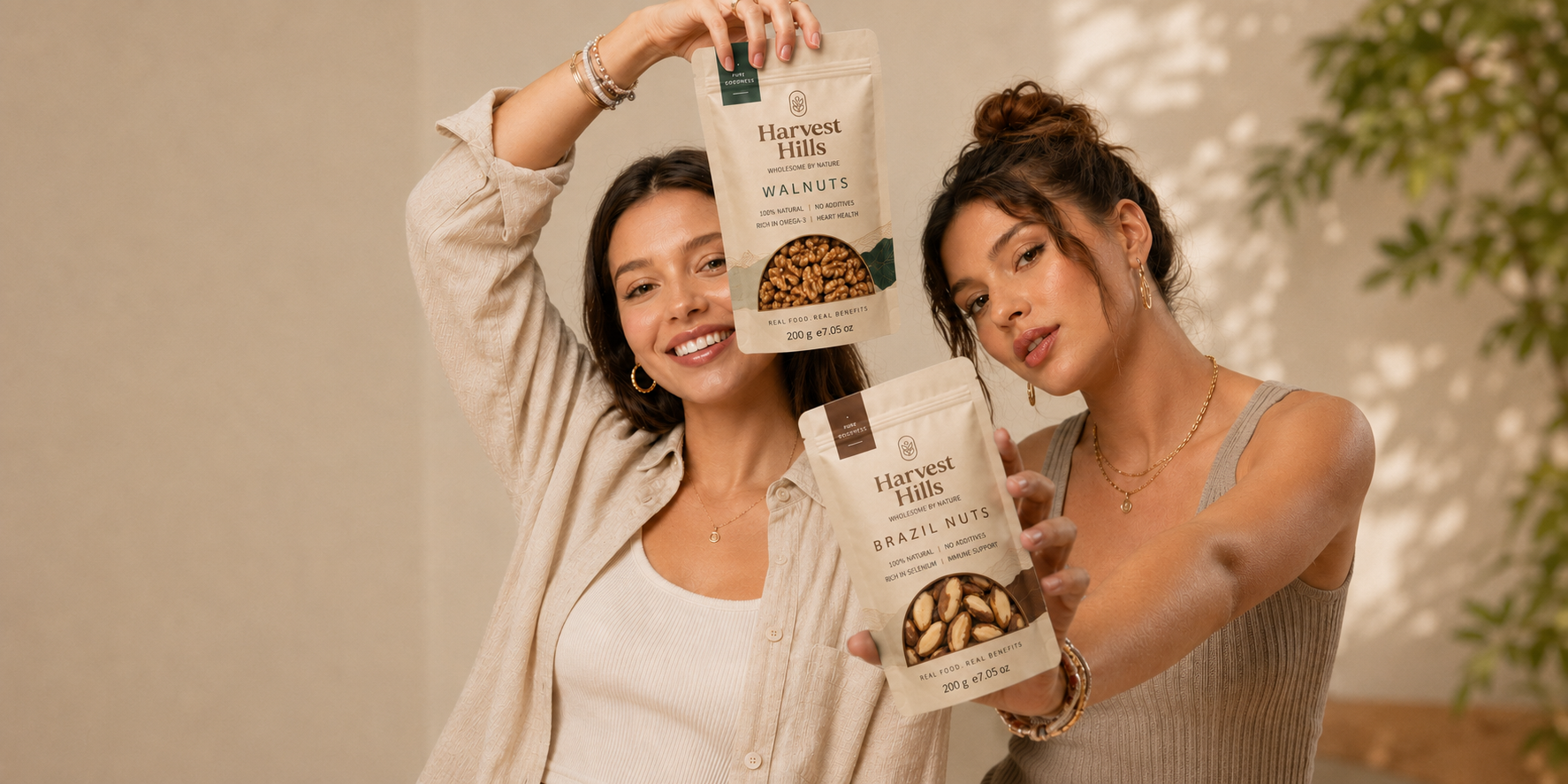
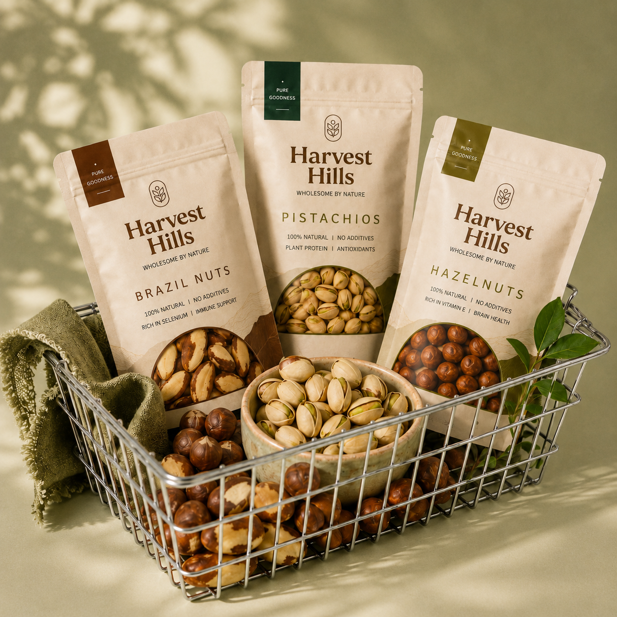
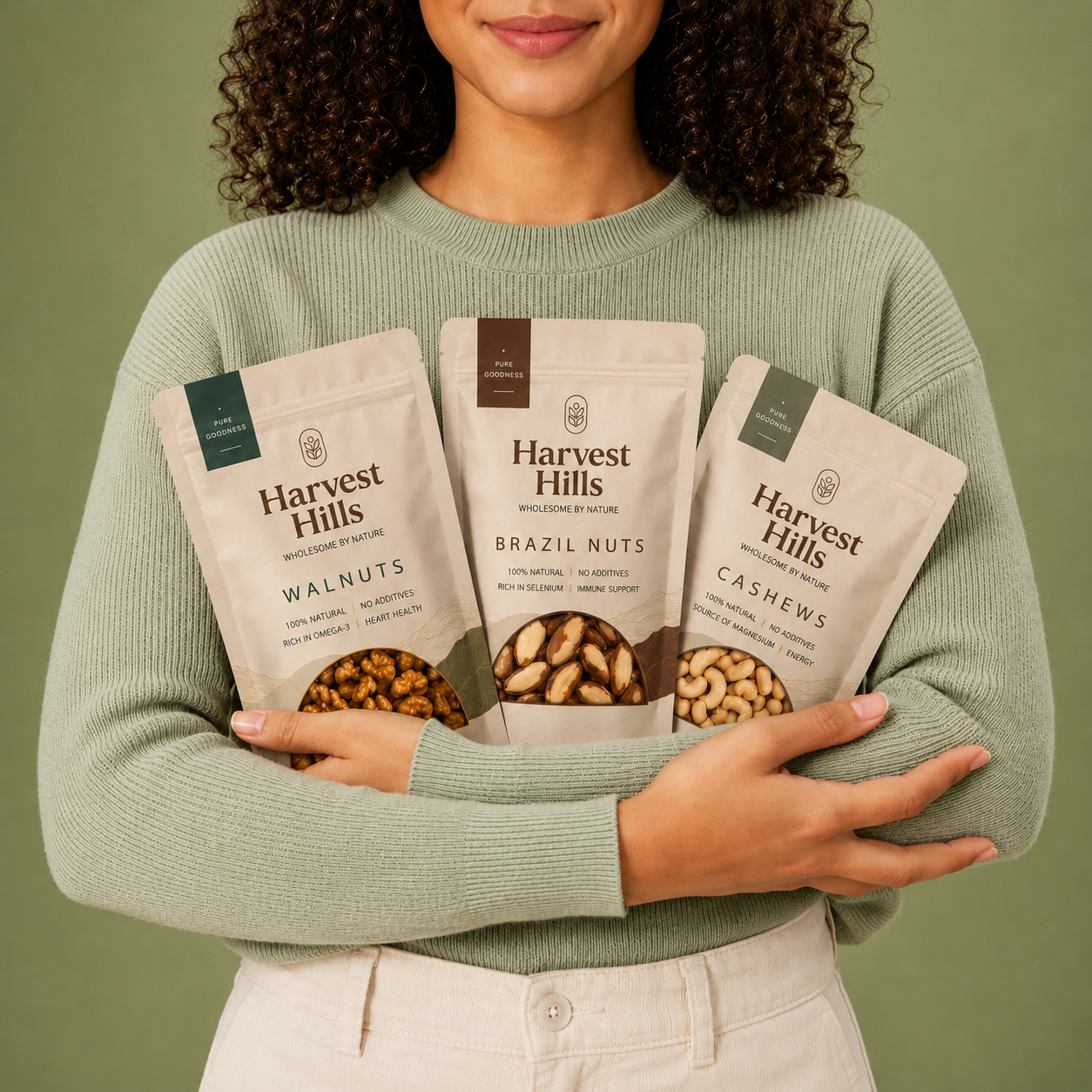
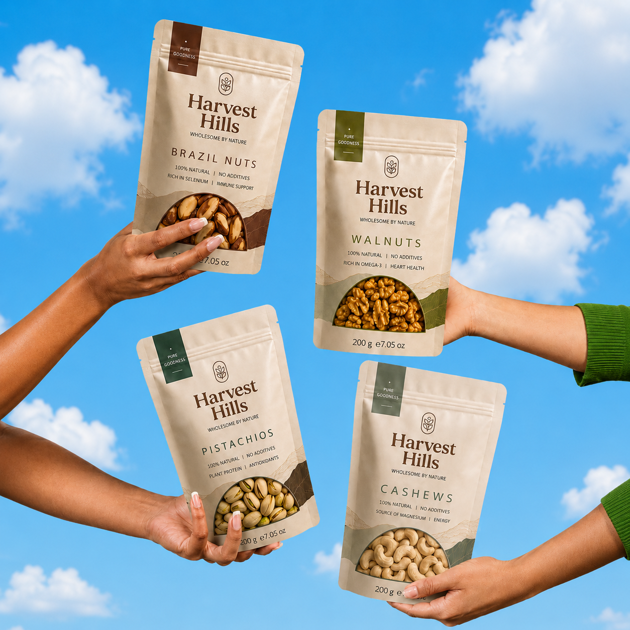
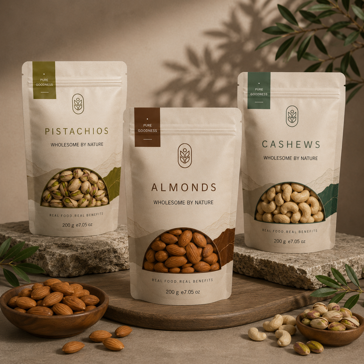
The packaging system was designed to create strong shelf visibility while maintaining consistency across the product range. Distinctive color accents help differentiate each variety, while transparent product windows showcase the natural quality of the nuts inside. Clean layouts, informative messaging, and premium matte finishes enhance consumer trust and create an elevated unboxing experience. The result is a cohesive packaging family that is both functional and visually engaging across retail and e-commerce channels.
Services
Brand Strategy • Brand Identity • Logo Design • Packaging Design • Print Design • Visual Identity • Product Mockups