
The Natal Crunch
Healthy Snacks Brand Identity & Packaging Design
The Natural Crunch is a modern healthy snacks brand created for consumers seeking nutritious, flavour-packed alternatives to traditional snacking. With a range of exciting flavours and high-protein offerings, the brand combines health, taste, and convenience for today’s conscious consumers. Positioned within the growing healthy FMCG category, The Natural Crunch promotes better snacking without compromising on flavour or enjoyment.
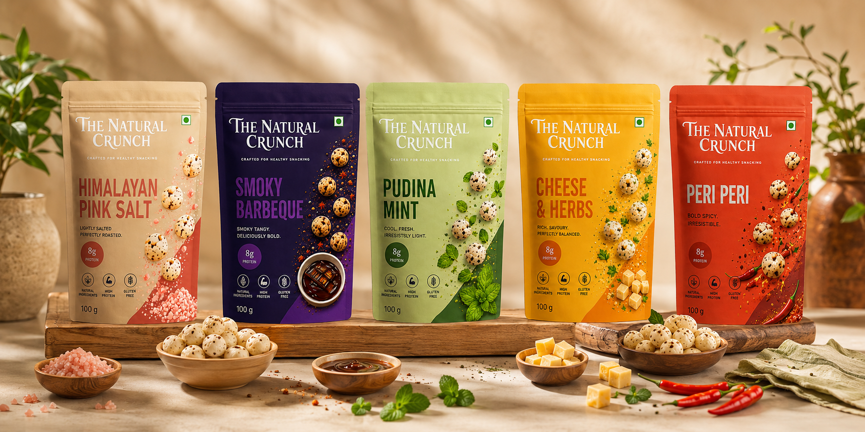
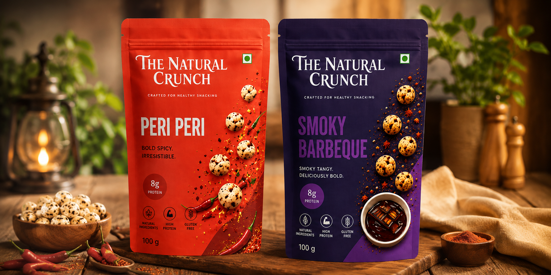
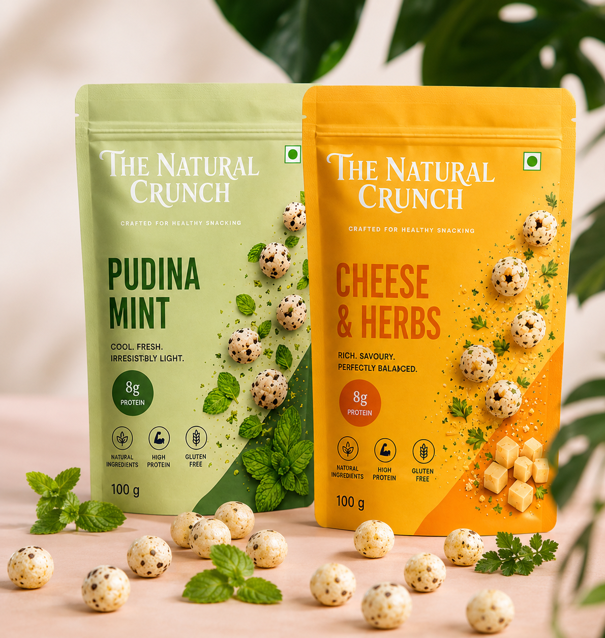
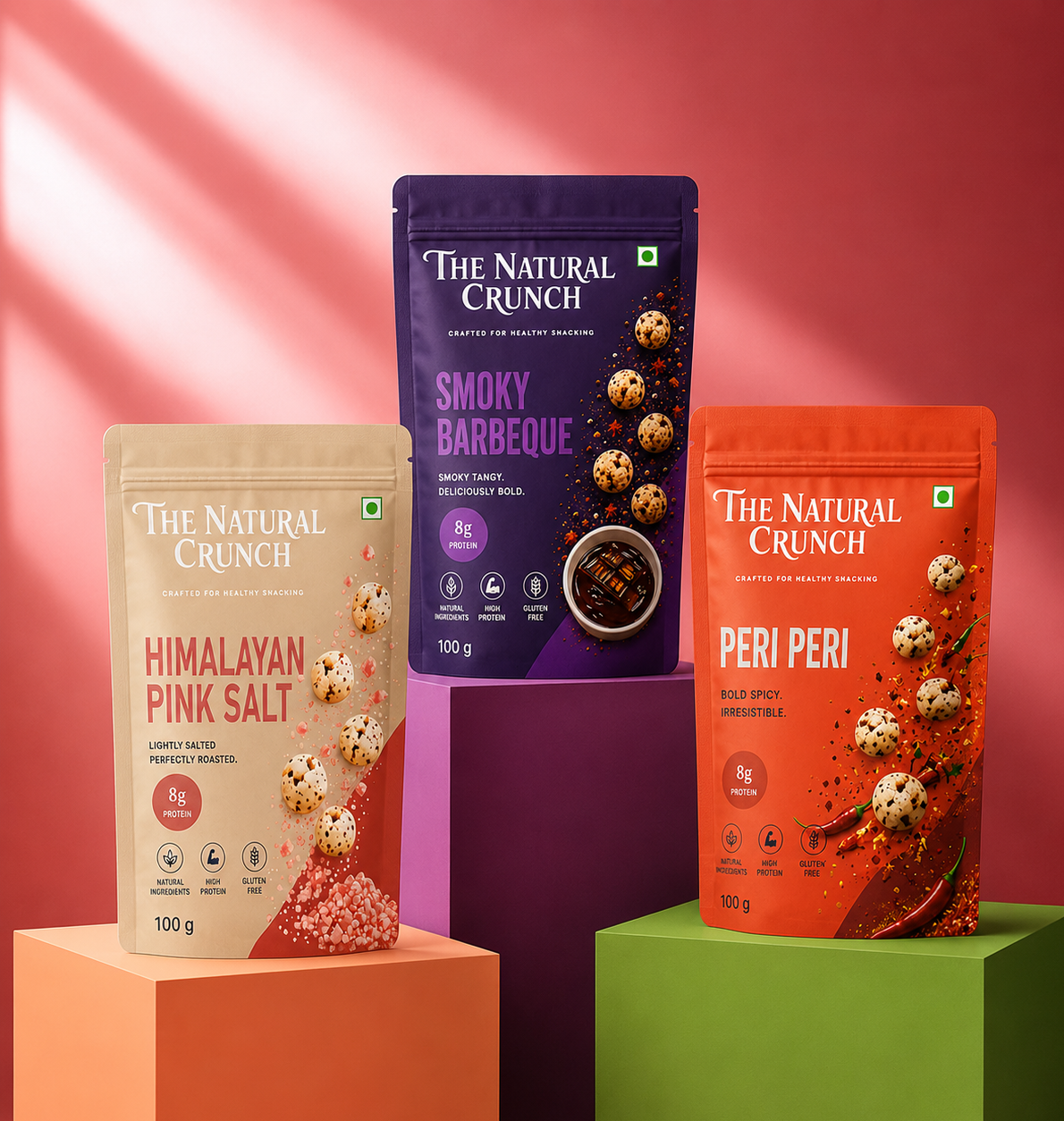
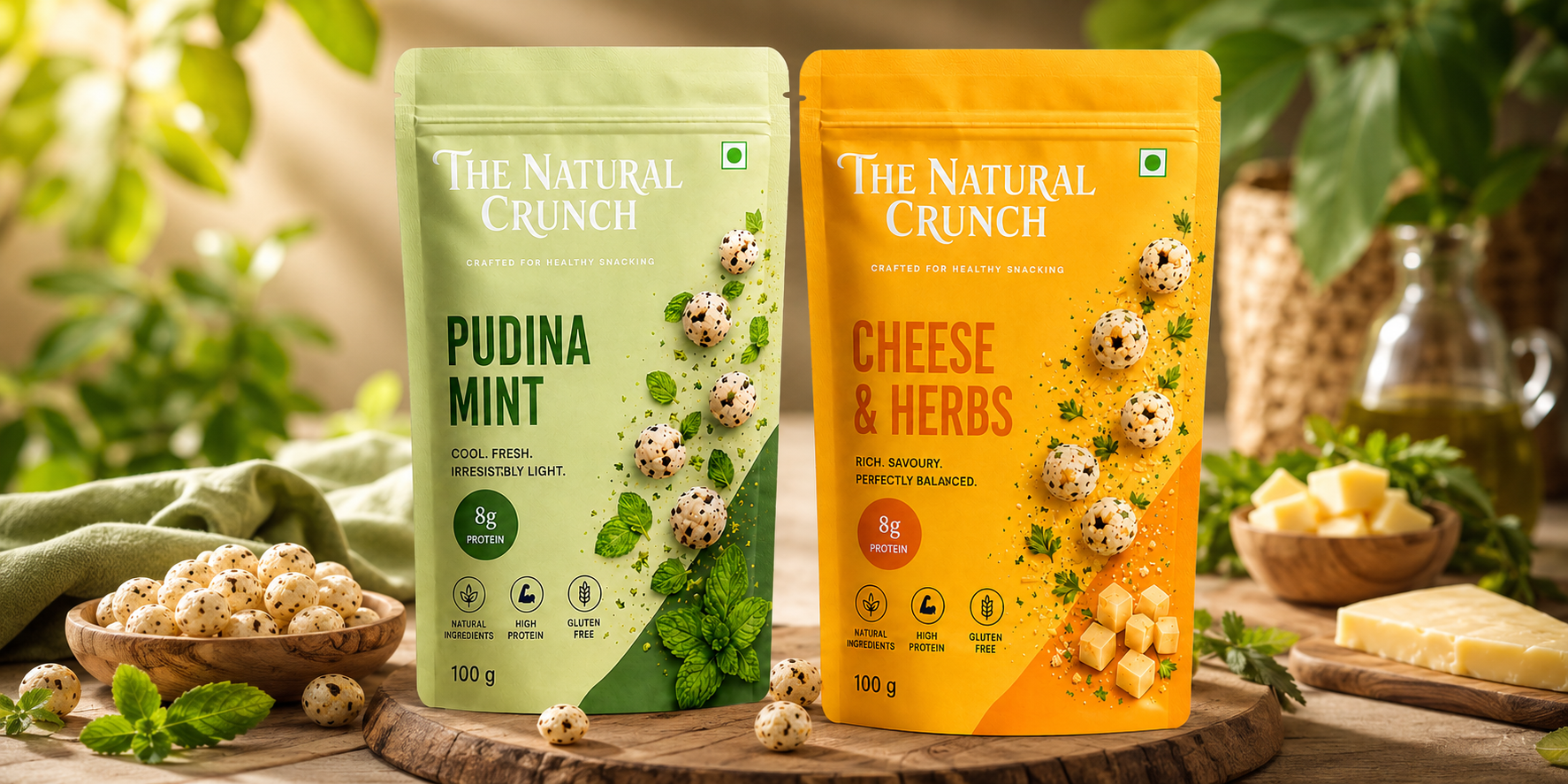
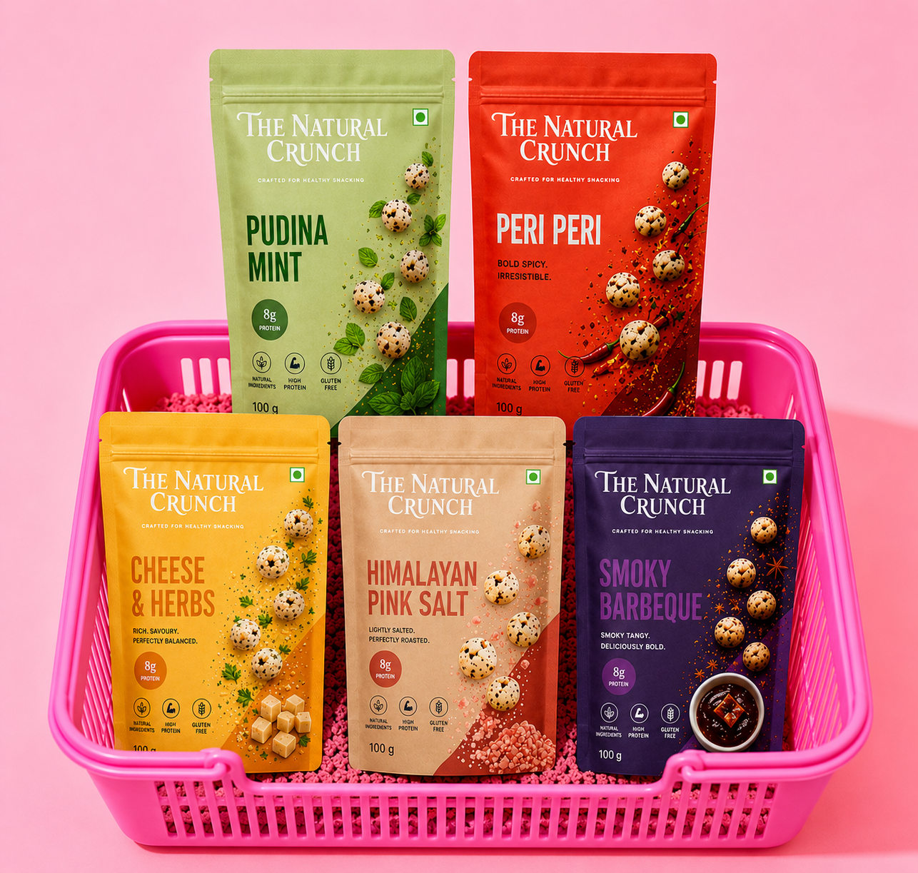
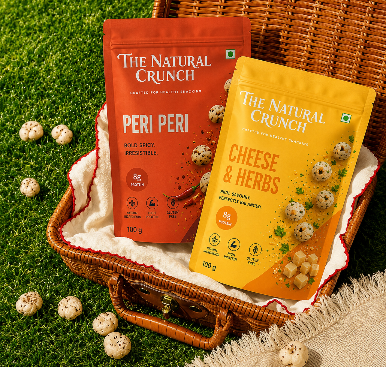
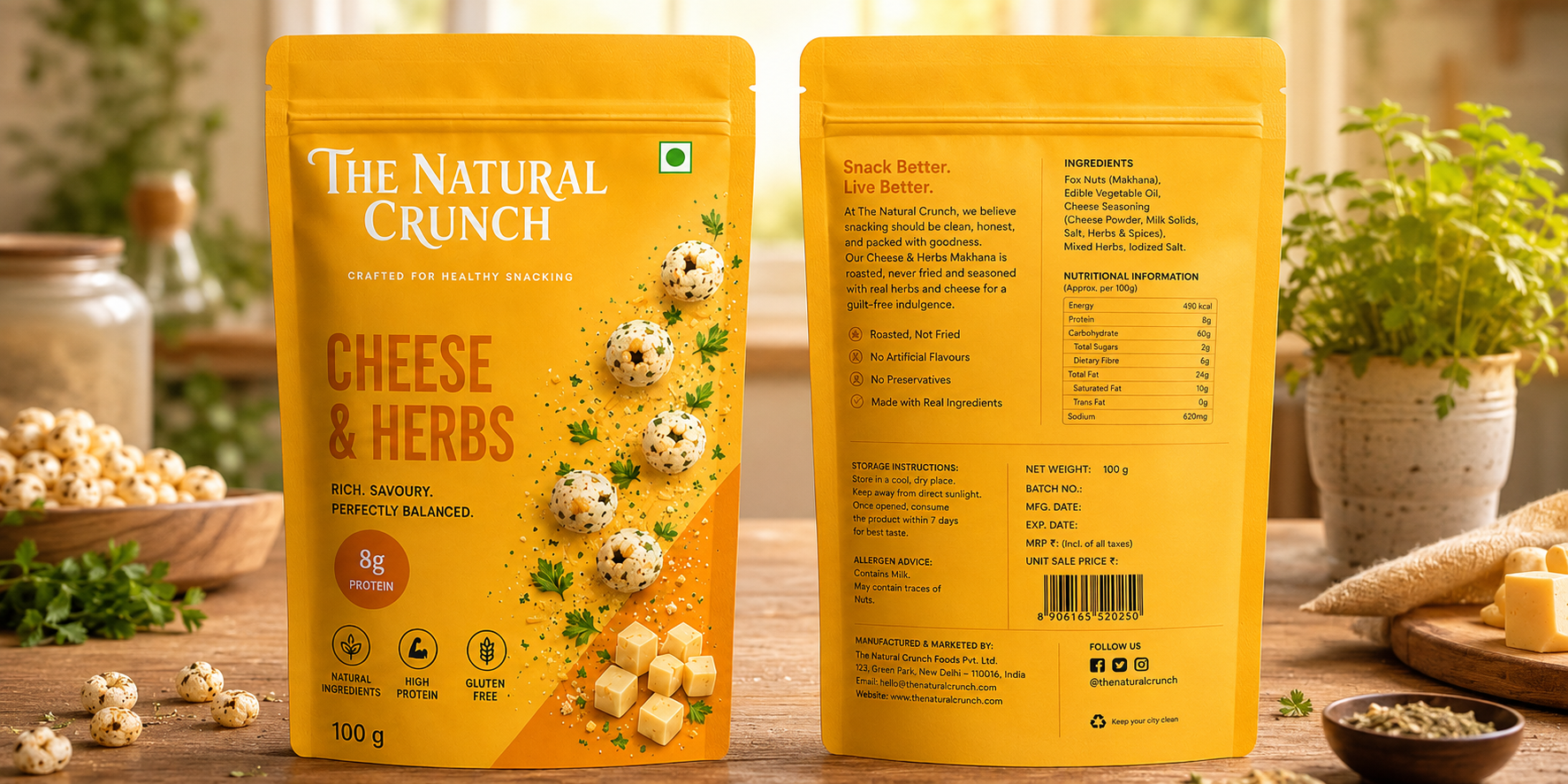
The brand identity was designed to feel bold, energetic, and approachable. A distinctive serif wordmark creates strong shelf recognition, while vibrant colour palettes help communicate the personality of each flavour variant. The visual system combines clean typography, dynamic layouts, and ingredient-inspired graphics to create a contemporary brand experience that appeals to health-conscious consumers and modern lifestyles.
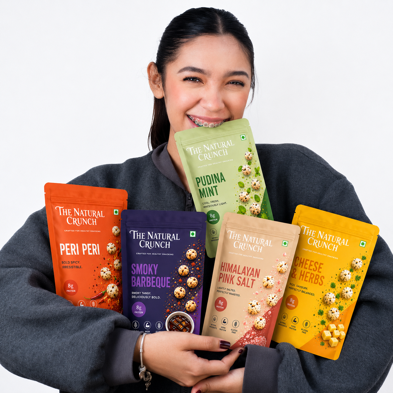
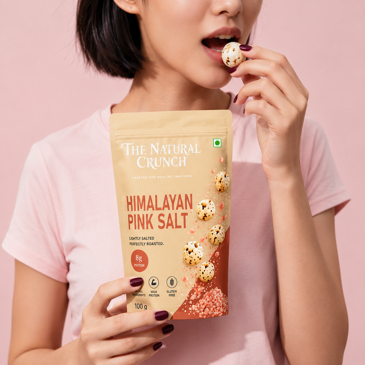
The packaging system was developed to maximize shelf impact and product differentiation across the entire range. Each flavour is represented by its own unique colour and visual cues, making navigation simple while maintaining a cohesive brand family. High-quality product imagery, clear nutritional messaging, and vibrant ingredient illustrations communicate flavour, freshness, and quality at a glance. The result is a visually engaging packaging range that captures attention in retail environments and performs effectively across e-commerce platforms.
Services
Brand Strategy • Brand Identity • Logo Design • Packaging Design • Print Design • Visual Identity • Product Mockups